


Final design, pages and flow for microsite using Figma. This functioning prototype was used to show executive leadership, stakeholders and developers the user experience for the new microsite I designed and implemented.
To help senior leaders and developers understand upgrades I recommended, I created a low-fi wireframe in Figma that could be easily updated, animated and handed off for production.
When the Chief Human Resources Officer for a global fashion & brand group wanted to launch a new recognition program, I visually designed and implemented a program that included easy-to-use and highly visible engagement features for the Company’s digital and office spaces. To demonstrate the interactive features as well as the layout and experience for the users, I created a functional prototype in Figma which also provided a valuable roadmap for developers who worked with me on backend buildout.
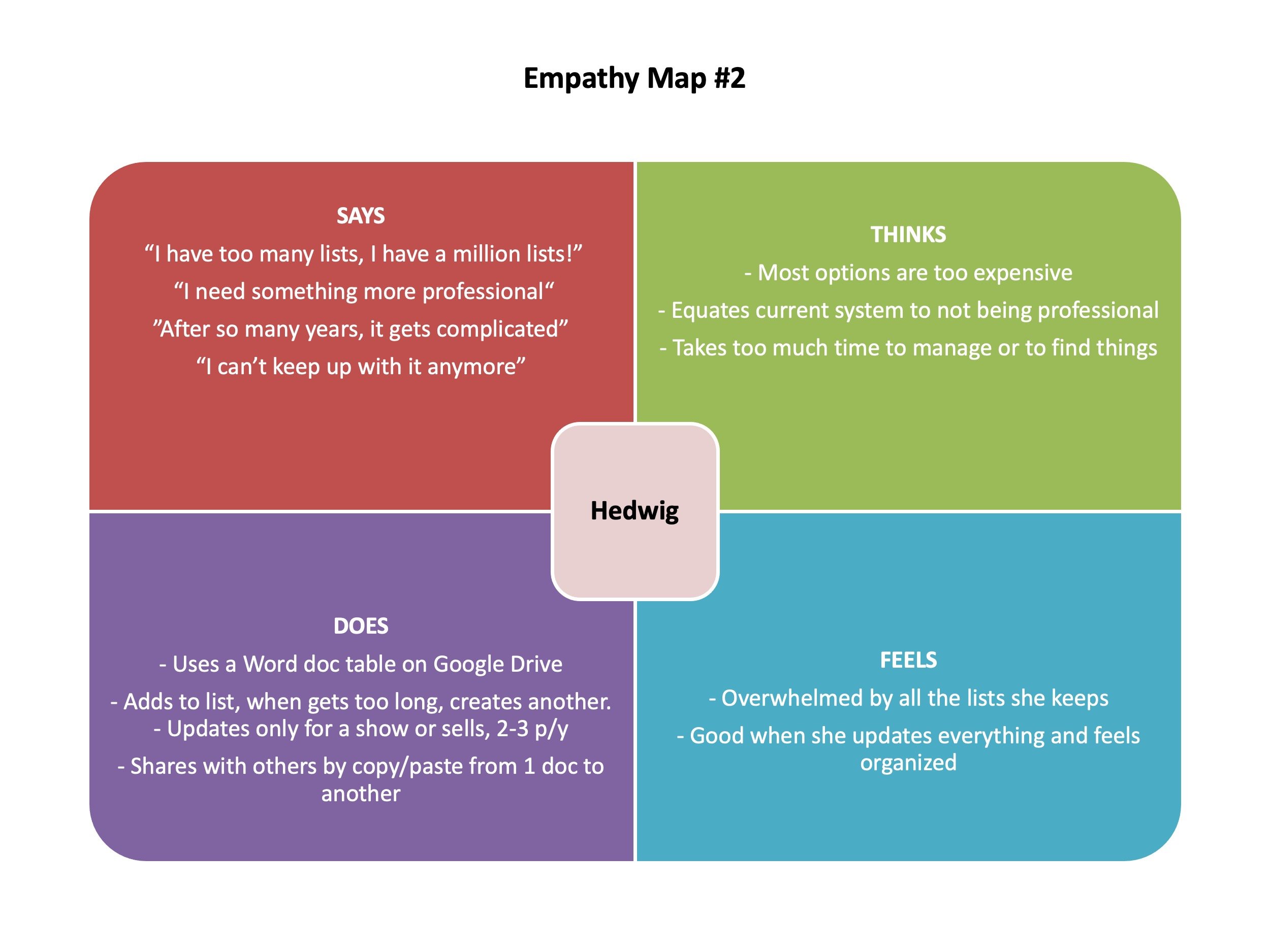
User research conducted for an artist inventory app I designed for Google UX Bootcamp included interviews with 5 artists varying across age, location and abilities. I created empathy maps to capture their experience and inspire creation of personas.
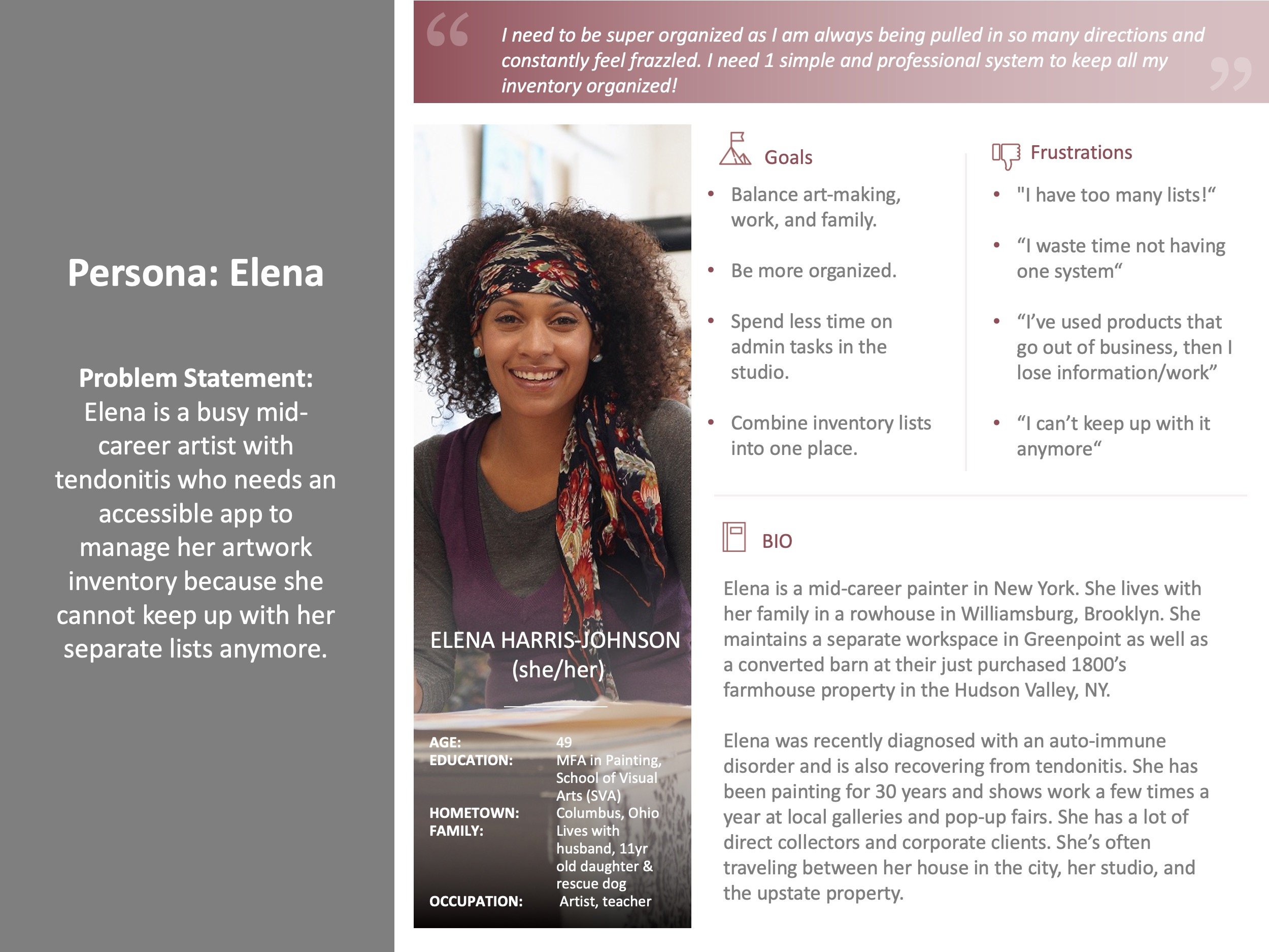
Example of one of the fictional personas for the artist inventory app. I used elements from live conducted interviews and combined them in a realistic way to capture common pain points and needs by typical users.
Before diving into Figma to create the low fidelity frames, I created several quick paper sketches to work out various options. I landed on this one because it provided a quick grid of all the work at the user’s fingertips.
Example of early lo fidelity wireframe adapted from the paper sketch for the collection page of the Artist Inventory app.
Once I had the user flow and journey map determined. I built out a lofi prototype for testing. I found several issues after user testing with 5 volunteers including extra steps not needed and the need for copy on all buttons.
Before building out the high fidelity screens, I designed a color palette for primary, secondary and tertiary colors.
After testing my low fidelity prototype I learned that users didn’t understand they were on the homepage, but rather thought they had landed on an internal drill down frame instead. I reworked the landing page as well as eliminated several extra screens and steps to make the experience more streamlined and intuitive.
Detail of the high fidelity wireframe, created in Figma, for the homepage of the Artist Inventory app.
Creating a wireframe like this provided a valuable resource to designers and developers by providing technical specs and ensure my design of the site could be produced successfully. It also served as a roadmap for content managers and future junior designers who would create assets for the site.
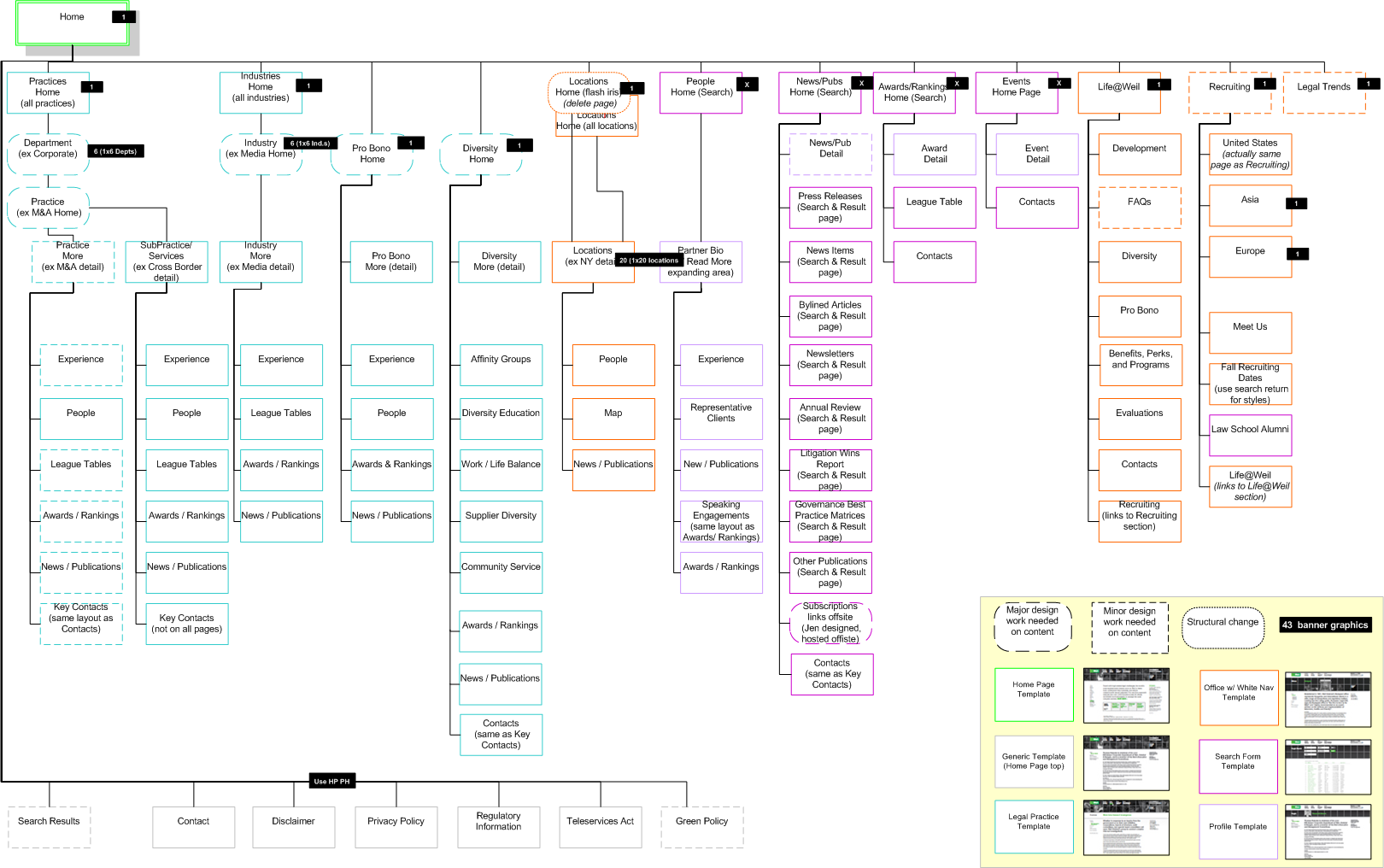
When my client, a global law firm with over 3000 employees, rebranded their site, I worked closely with the lead UX researcher and developers to ensure all parties stayed on track. I created and managed several Information Architecture matrices like this one. We also used this as a roadmap for taxonomy and navigation demonstration to align senior leaders on end choices before going live.